
Visual identity for World Floorball Championships 2025
No power like women power

WFC 2025 as a driver of women's development in floorball
The Women's World Floorball Championships returns to the Czech Republic after 12 years. As the claim “No Power Like Women Power” suggests, the main goal will be to utilize this pinnacle event to strengthen the position of women in floorball. Czech Floorball has collected world medals in recent years thanks to women and juniors, and the players will definitely not travel to Brno and Ostrava with any other goal in mind.
The Women's World Floorball Championships returns to the Czech Republic after 12 years. As the claim “No Power Like Women Power” suggests, the main goal will be to utilize this pinnacle event to strengthen the position of women in floorball. Czech Floorball has collected world medals in recent years thanks to women and juniors, and the players will definitely not travel to Brno and Ostrava with any other goal in mind.
Achievements of Czech women's floorball

Logo anatomy
The rounded shape is inspired by a floorball ball. Other elements stem from the essence of women's floorball. The logo takes the form of the letter W, which is the initial of the English word “women”. It consists of two embedded teeth, representing the ferocity that not only representatives but all women and girls who dedicate themselves to floorball bring to the sport.
Color scheme
The visual identity is tuned to light and energetic colors, which allude to the greater diversity of the female world, including the more pronounced emotions experienced during sports. The colors emphasize that women are strong and constitute an important part of one of the most popular Czech sports.

Logo formats
Logo variants
Logo application
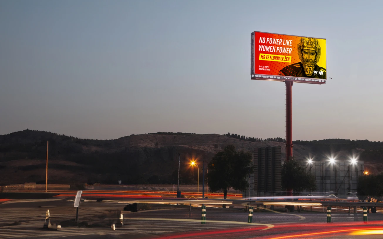
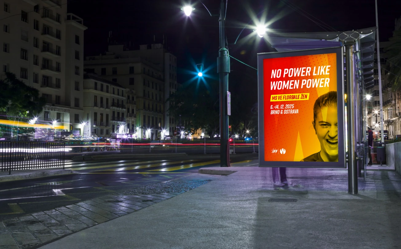
The logo on various colored backgrounds serves for presentation on websites, banners, social media, advertising brochures, as well as large-format printing on billboards and other advertising media. You can also encounter it as part of merchandising, with the main faces of the campaign being Czech representatives.
Logo application
The logo on various colored backgrounds serves for presentation on websites, banners, social media, advertising brochures, as well as large-format printing on billboards and other advertising media. You can also encounter it as part of merchandising, with the main faces of the campaign being Czech representatives.
Frequently asked questions
The World Floorball Championships will take place from December 6th to 14th, 2025, in Brno and Ostrava. Women's WFC is returning to the same cities and venues after 12 years - the first part of the tournament will be held in STAREZ ARÉNA VODOVA in Brno, and the play-off will conclude in OSTRAVAR ARENA in Ostrava.
Tickets for the World Floorball Championships 2025 will be on sale at the turn of the year 2024 and 2025
The first merchandise will be available for purchase at the BigBoard Superfinal 2024, with additional special items from the 2025 World Floorball Championships edition to follow at EFT 2024 in Karlovy Vary. Fans can look forward to a wide range of merchandise at the WFC, from clothing to souvenir items.
The World Floorball Championships draw regularly takes place after the qualification matches for the WFC, which are scheduled for February 2025.
Czech female floorball players have won two bronze medals - the first in 2011 at the World Floorball Championships in Switzerland and the second at the WFC 2023 in Singapore. The junior team has an even richer collection, with 4 bronze medals and achieving a historic final and finishing second at the last U19 World Floorball Championships in 2022.
In addition to team successes, Czech players regularly excel in the poll for the best female player on the planet - in 2020, the team captain Eliška Krupnová even won the poll.